
Short answer
Most QR codes fail because of low contrast, a cropped quiet zone, or an oversized logo — in that order. Check those three before anything else and you will solve the large majority of problems. If the code scans on your desk but not in the wild, the cause is usually print size or the surface it sits on.
Start by finding out whether it decodes at all
Before you change anything, it is worth separating two very different problems: a code that no scanner can read, and a code that reads perfectly but sends people somewhere broken. They look identical to a frustrated customer and have nothing in common underneath.
The quickest test is to open any plain QR scanner app — not your camera's built-in shortcut, which often hides the raw result — and see whether it produces text. If you get text back, the code is fine and your problem is in the content. If you get nothing, keep reading.
1. The contrast is too low
This is the big one. In our own testing it caused more failures than every other cause combined, and it is the one people find hardest to believe, because a low-contrast code still looks completely fine to the human eye.
A scanner does not see your code the way you do. It converts the camera image into pure black and white by picking a threshold, and anything that lands on the wrong side of that line becomes noise. A soft yellow or a pale sky blue that reads clearly on your monitor can collapse into the white background entirely.
We hit this ourselves. Three of the design presets we shipped on this site rendered beautifully and failed to decode at every resolution we tested. The cause was not the shapes or the gradient — it was that the gradients ended in colours too light to separate from white. Darkening the endpoints fixed all three without changing the design in any way a person would notice.
- Keep the dark modules genuinely dark. If you want colour, colour the foreground and leave the background near-white.
- Aim for a contrast ratio of at least 4:1, and treat anything under 3:1 as broken rather than risky.
- Do not invert the code (light modules on a dark background) unless you have tested it on several real phones.
- Avoid photographic or patterned backgrounds directly behind the code.
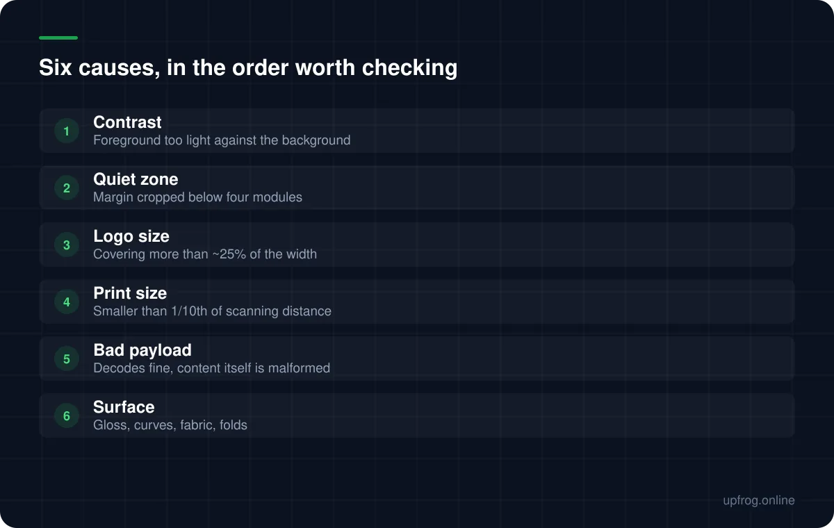
2. The quiet zone was cropped
The specification asks for an empty margin of at least four modules on every side. That blank border is not decoration — it is how a decoder works out where the code stops and the rest of the world begins.
This one is almost always introduced after the code is made. A designer drops it into a layout, the margin looks like wasted space, and it gets trimmed to sit flush against a headline. The result scans perfectly in the studio, on a white artboard, and then fails on the finished poster where it sits tight against a photograph.
If space is tight, shrink the whole code rather than the margin. A smaller code with a proper quiet zone beats a larger one without.
3. The logo is eating your error correction
A centre logo works because QR codes carry redundancy. At error-correction level H, roughly 30% of the code can be damaged and still be reconstructed. That is what lets you punch a hole in the middle and get away with it.
The catch is that the 30% is a budget, and the logo is not the only thing spending it. Print registration, ink spread, glare, a scuffed sticker and camera noise all draw from the same pot. A logo sized to use the entire allowance leaves nothing in reserve for the real world.
Keep a centre logo to about a quarter of the code's width, and always raise error correction to H when you add one. Our generator does that second part automatically, because forgetting it is such a common way to produce a code that works on screen and fails on paper.
4. It is printed too small for the distance
A workable rule of thumb: the printed code should be roughly one tenth of the distance you expect people to scan it from. Two metres away means about 20cm across.
There is a second, sneakier version of this problem. Longer content needs more modules, and more modules at the same physical size means each individual module is smaller. A code holding a long tracking URL can be physically identical to one holding a short link and still be far harder to read.
Shortening the URL is frequently the cheapest fix available. Stripping campaign parameters off a link can drop a code down several versions and visibly enlarge every module.
- 1
Measure the real scanning distance
Stand where your customer will actually stand. A table tent is read from 30cm; a window poster from two or three metres.
- 2
Divide by ten
That is your minimum printed width for the code itself, before the quiet zone.
- 3
Shorten the payload if the modules look dense
Remove tracking parameters, and prefer a short path on your own domain over a long one.
- 4
Print a real sample at final size
Not a scaled preview on screen. Paper at 100%, then scan it from the real distance.
5. The code is fine — the content is wrong
This is the failure that wastes the most time, because everything looks correct. The code decodes instantly, and the phone still does nothing useful.
Usually the payload is subtly malformed: a URL with no scheme, so the phone treats it as plain text rather than a link. A vCard missing its closing line. A Wi-Fi string where the password contains a semicolon that was never escaped, so everything after it is discarded.
The fix is unglamorous. Decode your own code with a plain text scanner, read the raw string with your own eyes, and check it character by character before you commit to print.
6. The surface is fighting the scanner
Gloss laminate throws the phone's own light straight back into the lens. Curved bottles distort the grid so the decoder cannot square it up. Fabric and corrugated card blur the edges between modules. A fold or a seam through the middle is usually fatal.
The other classic is a code that has been stretched or skewed to fit a layout. QR codes must stay square. Any non-uniform scaling breaks the geometry the decoder relies on, and no amount of error correction will recover it.
Print a test on the actual material, at the actual size, and scan it under the lighting the code will really live in — including at an angle, which is how people hold phones.
The pre-flight checklist
Before anything goes to a printer, walk this list. It takes about five minutes and it catches nearly everything.
- Scanned successfully on at least one iPhone and one Android device.
- Quiet zone of four modules or more intact on all four sides.
- Vector supplied to the printer (SVG or PDF), never an upscaled PNG.
- Payload decoded back to plain text and read character by character.
- Tested at final print size, on the final material, at the real distance and at an angle.
- If there is a logo, error correction is set to H and the logo is under a quarter of the width.
Frequently asked questions
- Why does my QR code work on screen but not when printed?
- Almost always size or surface. Screens are backlit, perfectly flat and high contrast; paper is none of those. Reprint at the size dictated by the scanning distance, check the quiet zone survived the layout, and test on the real material rather than plain office paper.
- Can I make a QR code any colour I want?
- You can choose any colour as long as it stays dark against a light background. The constraint is contrast, not hue. A deep red, green or blue is fine; pastels, yellows and mid-greys generally are not.
- Does adding a logo always break the code?
- No. A logo covering up to about a quarter of the width, with error correction set to H, is reliable. Problems start when the logo grows beyond that, or when it is added without raising the error correction level.
- How do I tell whether the code or the link is broken?
- Scan it with a plain QR reader that shows you the raw text. If you get the text you expected, the code is healthy and the problem is the destination. If you get nothing at all, it is the code.
Sources
Specifications and primary documentation referenced above.
- QR code error correction feature — Denso Wave
- ISO/IEC 18004:2015 — QR Code bar code symbology specification — ISO
- Understanding Success Criterion 1.4.3: Contrast (Minimum) — W3C Web Accessibility Initiative