
Short answer
You can restyle a QR code more than most people expect, because the decoder only samples the centre of each cell. Rounded modules, dots and gradients are safe. What breaks codes is low contrast, distorted corner patterns, and any change that moves ink away from a cell's centre.
The decoder only cares about the grid
Understanding one thing makes every design decision obvious. A QR decoder finds the three big corner squares, uses them to work out the grid, and then samples the centre of each cell to decide whether it is dark or light.
That is it. It does not care whether the cell is drawn as a square, a circle, a rounded blob or a tiny star — only what colour sits at the sampling point.
Which tells you exactly where the limits are. Any change that keeps ink at the centre of each cell is safe. Any change that moves ink away from the centre, blurs the boundary between neighbours, or distorts those three corner patterns costs you reliability.
Changes that are essentially free
These worked at every resolution we tested, and they work on scanners in circulation today.
- Rounded or dotted modules, as long as they stay centred in their cell.
- A gradient across the foreground, provided both ends stay dark against the background.
- Colouring the corner patterns differently from the body.
- Custom corner frame shapes that keep the concentric proportions readable.
The combination that surprised us
We assumed corner styling was mostly cosmetic. It is not, and we only found out because we tested all of it rather than a sample.
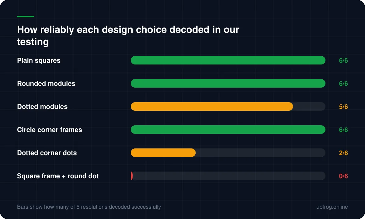
We rendered all 36 combinations of our six corner frame shapes and six corner dot shapes, then decoded each at six different resolutions. Five combinations failed every single attempt — not marginal, not resolution-dependent, simply unreadable.
The clearest example is a square corner frame with a round dot inside it. It looks completely reasonable. It decoded zero times out of six, while a plain all-square control passed six out of six in the same run.
The reason is that decoders locate a code by scanning lines through those corner patterns and looking for a specific ratio of dark and light runs. Change the shape of the inner dot enough and that ratio no longer matches, so the decoder never finds the code to begin with. No amount of error correction helps, because error correction operates on data the decoder has not managed to locate.
Changes that cost you margin
Each of these is survivable alone and dangerous in combination. Stack two or three and you are relying on luck.
- A centre logo — budget no more than a quarter of the width.
- Very thin module shapes, which shrink the area actually sampled.
- Colour pairs that look fine on a monitor but sit close in luminance.
- Small print sizes, rough stock, or anything laminated and glossy.
Changes that simply break codes
Do not rotate, stretch or shear the code — it must stay square, and non-uniform scaling destroys the grid geometry.
Do not round the corner patterns so heavily that they stop reading as concentric shapes.
Do not place a code across a fold, a seam, or the join between two materials.
And avoid surfaces that move or reflect. A code behind glass in direct sunlight is a code nobody will scan, no matter how well designed it is.
A workflow that keeps you out of trouble
Design freely, then verify deliberately. The order matters, because it is much cheaper to reject a design at step four than after the print run.
- 1
Style the body first
Pick your module shape and colours. Check the contrast reading as you go — this is where most failures are born.
- 2
Style the corners second, and keep them coherent
Match the corner dot to the frame. Sharp with sharp, round with round.
- 3
Add the logo last, and raise error correction to H
Keep it under a quarter of the width, and leave clear space around it.
- 4
Export as vector
SVG or PDF, so the printer is not upscaling a bitmap.
- 5
Decode it back before you ship it
Read the raw text. Then print one at final size and scan it in bad light, at an angle, from the real distance.
Test like a user, not like a designer
Your studio conditions are the best case your code will ever encounter. Every real scan is worse: dimmer, further away, at an angle, on a three-year-old phone with a scratched lens and a cheap screen protector.
If it only works when held perfectly square in good light, it does not work.
Frequently asked questions
- Do rounded or dotted QR codes scan worse than square ones?
- Barely, if at all, provided each dot stays centred in its cell and the contrast is good. In our testing rounded modules matched plain squares exactly, and dotted modules were only slightly behind.
- Can I use a gradient in a QR code?
- Yes, as long as both ends of the gradient stay dark against the background. Gradients that fade towards a light colour are one of the most common causes of codes that look great and do not scan.
- Why does my code stop scanning when I change the corner shapes?
- Decoders find a code by looking for a specific pattern of dark and light runs through the three corner squares. Some frame and dot combinations distort that pattern enough that the decoder never locates the code. Keeping the corner dot's shape consistent with its frame avoids the problem.
- How big can my logo be?
- About a quarter of the code's width is a safe ceiling with error correction at H. That level can recover roughly 30% of the code, but print defects and glare draw on the same budget, so spending all of it on the logo leaves no margin.
Sources
Specifications and primary documentation referenced above.
- QR code error correction feature — Denso Wave
- ISO/IEC 18004:2015 — QR Code bar code symbology specification — ISO
- Understanding Success Criterion 1.4.3: Contrast (Minimum) — W3C Web Accessibility Initiative