Short answer
Keep a centre logo under about a quarter of the code's width and set error correction to level H. That level can recover roughly 30% of a damaged code, but print defects and glare spend from the same budget, so leave some in reserve rather than using it all on the logo.
Why this works at all
Covering part of a QR code with a logo sounds like it should destroy it, and the only reason it does not is error correction. A QR code carries redundant data calculated with Reed–Solomon coding, so a decoder can reconstruct whatever the logo is hiding.
At error correction level H, roughly 30% of the symbol can be lost and still be rebuilt. That is the entire mechanism behind every branded QR code you have ever seen.
Which also means the rules are not aesthetic preferences. They are arithmetic about how much data you can afford to destroy.
The size limit, and why it is lower than 30%
People read 'recovers 30%' and conclude a logo may cover 30% of the code. That is the single most common mistake here.
The 30% is a shared budget. Print registration drift, ink spread on absorbent stock, a scuff on a sticker, glare from a laminate, camera noise and an off-square scanning angle all consume part of it before your logo is considered at all.
Spend the whole allowance on the logo and the code works perfectly on your monitor and fails on a printed flyer under shop lighting. Keeping the logo under about a quarter of the width leaves a genuine reserve for the physical world.
What makes a good logo for this
Not every mark works in the middle of a QR code, and the constraints are unusual.
- Simple, solid shapes read better than detailed illustration at small size.
- High internal contrast — a pale logo on a white plate disappears and looks like a printing error.
- Square or circular silhouettes waste less of the budget than wide, thin wordmarks.
- A small clear margin around the logo stops modules touching it and looking like smudges.
- Avoid a logo that is itself mostly white, since it will not read as deliberate.
The backing plate question
Most generators, ours included, offer to clear the modules underneath the logo rather than simply drawing over them. It is worth understanding the difference.
Drawing over the top leaves partially covered modules around the logo's edge, which decoders can misread as ambiguous. Clearing the area produces a clean rectangular hole, which the error correction handles predictably.
A backing plate — a solid shape behind the logo — makes the result look deliberate rather than damaged, and gives a logo with transparency somewhere to sit.
How to do it
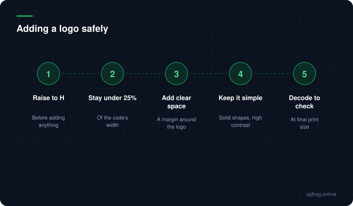
The order matters more than any individual setting.
- 1
Set error correction to H first
Changing it afterwards regenerates the whole pattern, so do it before you judge anything visually.
- 2
Shorten the payload if you can
A shorter URL means fewer, larger modules, which leaves more room for the logo to sit without crowding.
- 3
Add the logo and keep it under a quarter of the width
Start smaller than you think you want and grow it only if the code still decodes comfortably.
- 4
Decode it back and check
Not just that it scans, but that it scans quickly and from an angle. A code that takes three seconds to lock on is already marginal.
- 5
Print one at final size before committing
This is where an over-ambitious logo actually shows up.
When to skip the logo
There are cases where a centre logo is not worth the risk. Very small print sizes, absorbent or textured stock, long payloads that already produce a dense code, and anything scanned at distance all narrow the margin considerably.
In those situations, brand the code by colouring it instead. A code in your brand colour with a strong dark tone costs nothing in reliability, whereas a logo always costs something.
Frequently asked questions
- How big can a logo be in a QR code?
- About a quarter of the code's width is a safe ceiling with error correction at level H. The theoretical limit is higher, but print defects and glare draw on the same recovery budget, so using all of it on the logo removes your margin for error.
- Do I have to change error correction when adding a logo?
- Yes. Set it to H. At lower levels the code has far less redundancy to spare, and a logo that looks fine on screen will fail once printing and lighting take their share.
- Should the modules behind the logo be removed?
- Generally yes. Clearing them produces a clean area the error correction handles predictably, whereas drawing over the top leaves partially covered modules at the edge that decoders can misread.
- Can I put a logo on a small printed code?
- It is risky. Small codes already have small modules, and a logo removes some of the few you have. Below roughly 2cm, colouring the code is a safer way to brand it than covering part of it.
Sources
Specifications and primary documentation referenced above.