
Short answer
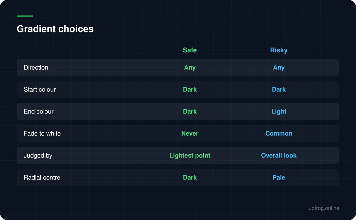
A gradient is fine as long as both ends stay dark against the background. Codes fail when a gradient fades towards a light colour, because the pale end of the code loses contrast entirely. Judge a gradient by its lightest point, not its average.
Why gradients are allowed at all
A decoder samples each module independently and asks a single question: is this point dark or light? It does not care whether neighbouring modules are the same colour, so a gradient across the code is not inherently a problem.
That is why gradient codes work at all, and why they can look as elaborate as you like as long as one condition holds.
The one rule
Both ends of the gradient must be dark against the background. Not the average, not the midpoint — both ends.
The failure mode is a gradient that starts strong and fades towards something pale. The dark half of the code decodes fine; the pale half stops being distinguishable from the background, and since a decoder needs the whole grid, the code fails entirely.
It looks like a partial problem and behaves like a total one.
Linear versus radial
Linear gradients are the easier of the two to get right, because you can see both endpoints and check them directly.
Radial gradients hide the risk better. A radial fade that is dark at the edges and pale in the centre destroys the middle of the code, which is precisely where a logo often sits too. If you use radial, keep the centre dark and let the edges be the lighter of the two — and even then, keep both within a safe range.
Getting it right
A short method that avoids the whole class of problem.
- 1
Pick two colours you would both accept as solid
If either endpoint would be too light as a single-colour code, it is too light as a gradient endpoint.
- 2
Check the contrast reading at both ends
The generator evaluates the weakest endpoint rather than an average, precisely because that is what determines whether the code works.
- 3
Prefer a narrow, tonal shift
Dark green to dark teal looks considerably more sophisticated than a rainbow and carries no risk.
- 4
Keep the corner patterns solid
The three corner patterns do the locating. Leaving them a single strong colour costs nothing visually and protects the part of the code that matters most.
Frequently asked questions
- Do gradient QR codes scan?
- Yes, provided both ends of the gradient are dark against the background. Gradients fail when one end fades towards a light colour, because that region of the code loses contrast and the decoder cannot read the full grid.
- Is a radial or linear gradient safer?
- Linear, mostly because both endpoints are easy to see and evaluate. Radial gradients can quietly wash out the centre of the code, which is also where a logo usually sits.
- Can a QR code gradient fade to white?
- No. That is the single most common way a gradient breaks a code. Fade between two dark colours instead — the effect is nearly as strong and it actually works.
Sources
Specifications and primary documentation referenced above.
- Understanding Success Criterion 1.4.3: Contrast (Minimum) — W3C Web Accessibility Initiative
- ISO/IEC 18004:2015 — QR Code bar code symbology specification — ISO