Short answer
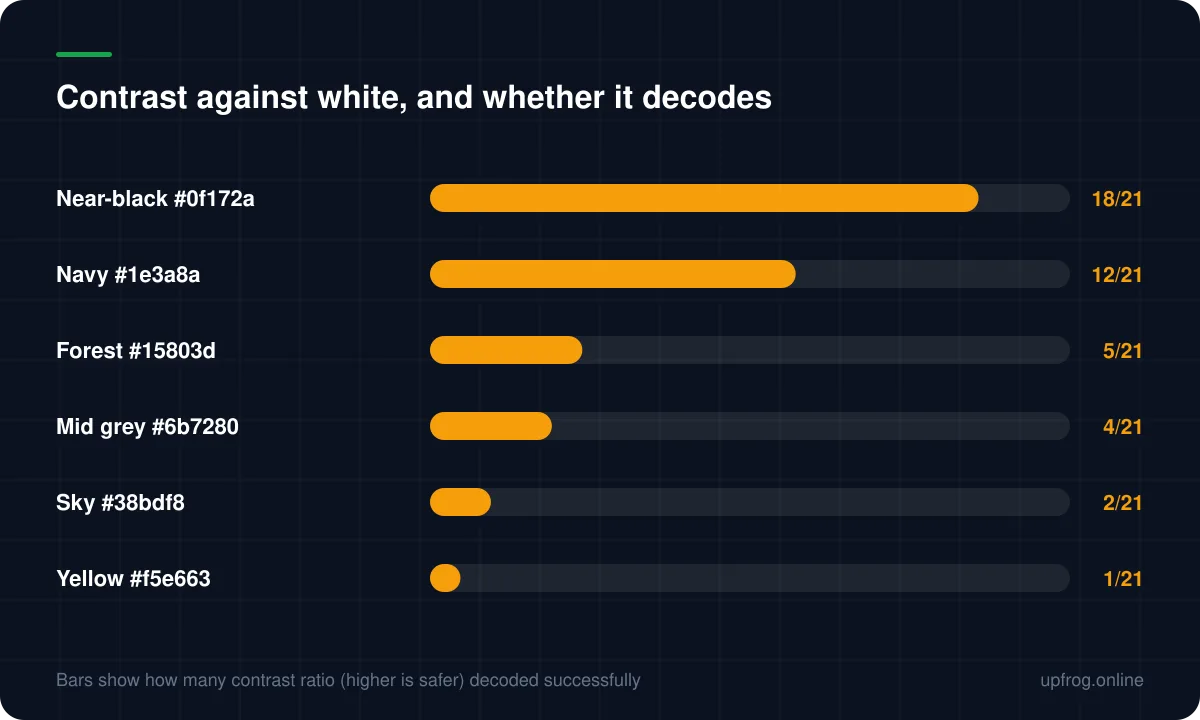
A scanner converts your code to pure black and white using a brightness threshold, so what matters is luminance contrast, not hue. Any dark colour on a light background works. Pastels, yellows and mid-greys fail even though they look perfectly clear to a human eye.
The decoder does not see colour
This is the whole thing in one sentence: a QR decoder converts the camera image into pure black and white by picking a brightness threshold, and then reads which side of that line each module falls on.
Hue is irrelevant. A deep red, a navy and a forest green are all simply 'dark' as far as the decoder is concerned. What matters is luminance — how bright the colour is, not what colour it is.
Which explains the failure that catches everyone: a soft yellow looks vivid and obviously visible to a person, and lands on the light side of the threshold, so the decoder sees an almost blank square.
We got this wrong ourselves
Three of the design presets originally shipped on this site rendered beautifully and decoded at zero of the six raster resolutions we test at. Nothing was wrong with their shapes or their structure.
The problem was that their gradients ended in light colours — a sky blue and an amber — that could not be separated from a white background. Darkening both endpoints fixed all three, and the visual difference is small enough that most people would not notice.
It is a good illustration of why contrast deserves a number rather than an opinion. Every one of those presets looked fine.
How much contrast is enough
The generator shows a live contrast ratio calculated the same way accessibility tools calculate it, using WCAG relative luminance. It is a convenient, well-defined measure of exactly the thing decoders care about.
- 7:1 or higher — strong. Scans reliably in poor conditions.
- 4:1 to 7:1 — workable, but test at final size on the real material.
- Below 4:1 — treat as broken. Most scanners will fail, whatever it looks like on screen.
Inversion, and why it is a gamble
Light modules on a dark background — an inverted code — is visually striking and technically outside what many decoders expect. Support varies: some handle it, some do not, and you cannot tell which your audience has.
For a screen where you can test the specific context, it may be acceptable. For print at scale it is a real risk with no compensating benefit, since a normal code on a light plate achieves the same design goal reliably.
Practical palettes that work
If you want a coloured code that will not cause problems, the safe zone is broader than people assume.
- 1
Take your brand colour and darken it
Most brand colours are tuned for screens and sit too light. The darker variant usually still reads as your brand.
- 2
Keep the background white or near-white
Off-white is fine. Tinted backgrounds cost more contrast than they appear to.
- 3
Check the ratio, do not eyeball it
The generator shows it live. Eyes are unreliable for this specific judgement.
- 4
Colour the corner patterns separately if you want accent
A different colour on the corners is safe as long as it is also dark, and it adds brand character without touching the data modules.
Frequently asked questions
- Can a QR code be any colour?
- Any colour that is dark against a light background. The constraint is luminance rather than hue, so deep reds, greens, blues and purples are all fine while pastels, yellows and mid-greys generally are not.
- What contrast ratio does a QR code need?
- Aim for 7:1 or better. Between 4:1 and 7:1 will usually work but should be tested at final size on the real material. Below 4:1, expect failures.
- Can I invert a QR code, light on dark?
- Some scanners handle inversion and some do not, so it is a gamble with no upside over placing a normal code on a light plate. For print at any scale, avoid it.
- Why does my yellow QR code not scan?
- Yellow is very light in luminance terms even though it looks vivid. Against white it produces almost no contrast for the decoder's threshold, so the code reads as a nearly blank square.
Sources
Specifications and primary documentation referenced above.
- Understanding Success Criterion 1.4.3: Contrast (Minimum) — W3C Web Accessibility Initiative
- ISO/IEC 18004:2015 — QR Code bar code symbology specification — ISO
- QR code error correction feature — Denso Wave